Changelog –

Bulk uploads, Premium, and more

It's now more efficient to get your work onto Refrakt and show it off!


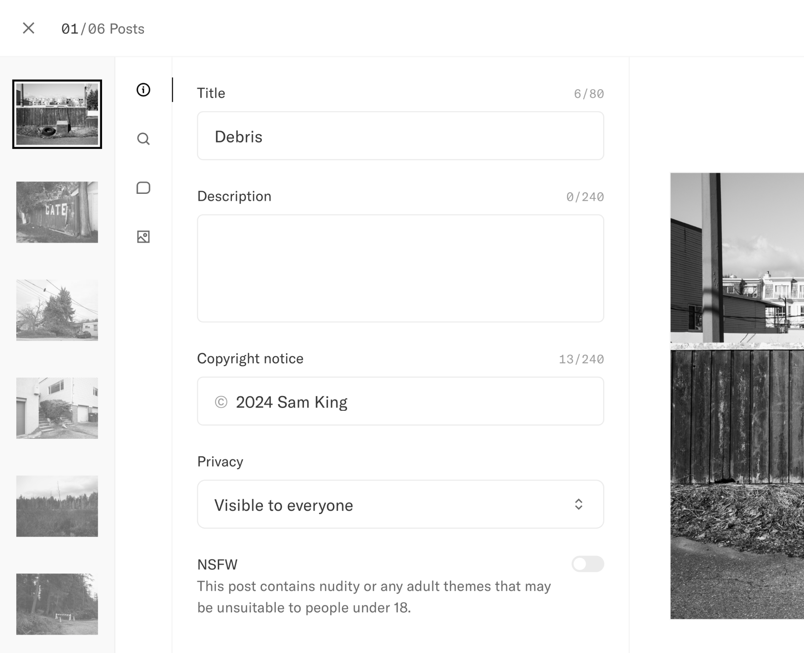
A screenshot of the new post page, featuring the new bulk upload flow.

Bulk uploads from the new post page

There's been a lot going on since our last update in January, but progress was a little slower than anticipated. Sam has moved to Canada so he hasn't been able to spend as much time building. However we've still managed to launch a couple of new things and made a bunch of improvements.

Bulk uploads

Previously, the only way to upload your work to Refrakt has been to create posts one by one. This was fine if you wanted to quickly post a single image to the feed, but not so great if you had a batch of new work to go into a Series. We planned bulk uploads to only be used from within a Series, but later decided to make it a bit more universal and accessible from multiple places.

You can now upload as many photos as you like in one go, so long as each file is within the file size limit of your account.

There's a couple of ways to do this. First is via the New Post flow which is accessible from the main menu and when adding photos to a Series. The second is from the Files tab in your Studio.

If you're uploading from the Files tab, your images will not attached to any posts. This is useful if you just want to upload a bunch of images, and then create posts later on when you have more time.

We also made some changes to publishing. By default, posts are only added to your Studio, and publishing to feeds is a separate step. If you're creating a single post, you can still publish straight away, but bulk posting will always go to your Studio. We made this change to prevent the feeds from being flooded when you create a lot of posts. All the details of the post will be saved, so you only have to press a single button to publish. Post can still be added to Series and Collectives in their unpublished state. This method of publishing also opens up the door for scheduling posts later down the line.

Premium

If you don't already know, Refrakt has been independently funded by Sam and a few lovely Patrons. This has been great to get things off the ground, but we also need to ensure we have a good path to sustainability. We have no plans to make excess profit. Instead our goal is to generate enough revenue to cover the cost of building and maintaining the platform, and reinvest the rest into community things like events. These costs are things like servers and storage, salaries for Sam and hopefully another person to help on the marketing side, and any other business expenses like legal and financial fees.

Sam has been building Refrakt in his spare time for the last year with no salary, but he'd love to work on Refrakt full-time. Right now, we have enough runway to keep the servers and storage going at their current rate for about 2 years without the additional business costs.

Premium is one of the ways we could eventually achieve those goals.

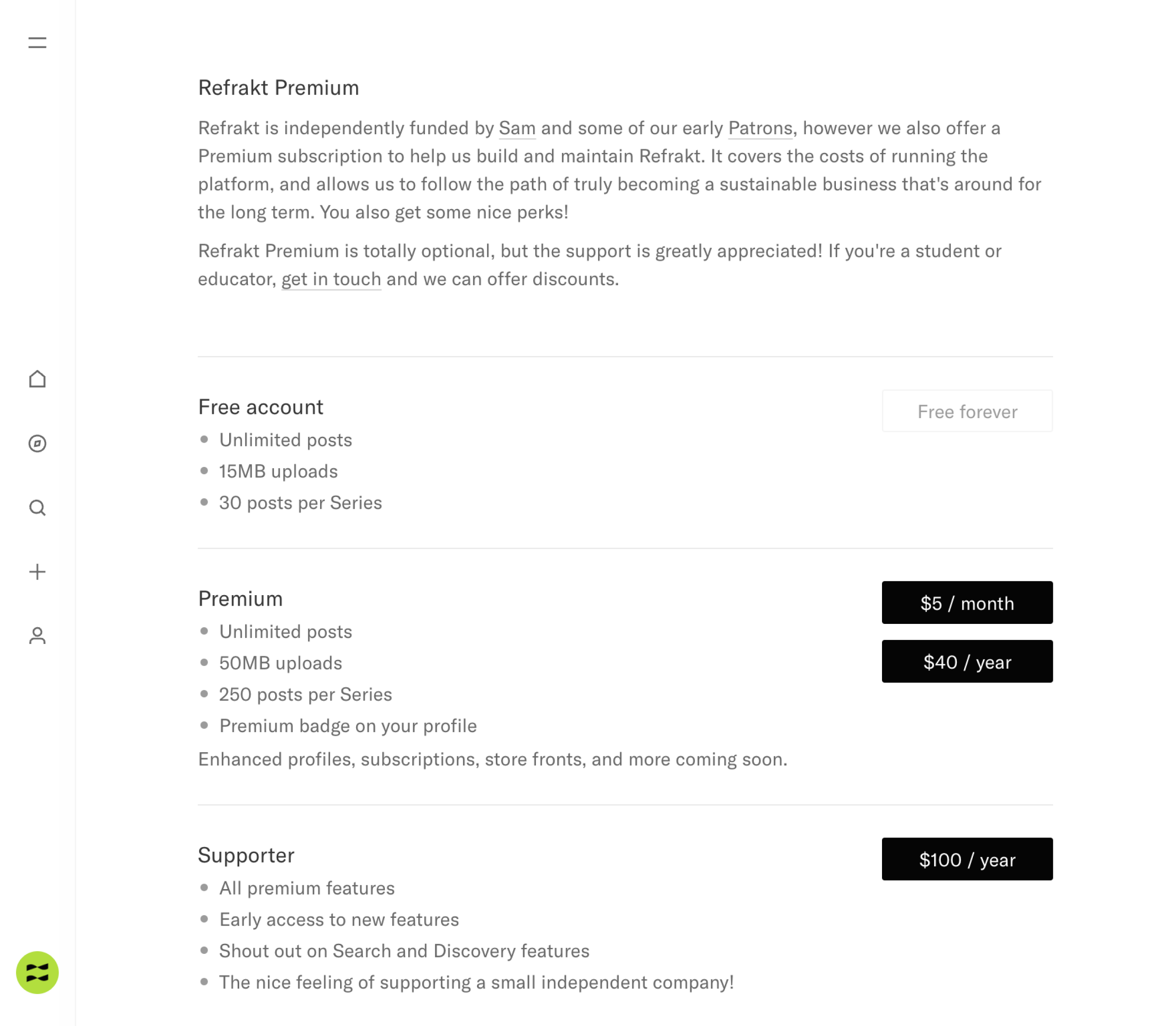
A screenshot of the Premium plans page which shows pricing and descriptions

Our new Premium plans page

We want Premium to be a thing people feel good about paying for, and we want it to be fair. We have some very strong principles we want to keep to:

  • There should always be a high quality free version.

  • Premium plans should be affordable.

  • It has to be worth paying for, and add real value.

  • It should be easy for people to pause or cancel (shaking our heads at you Adobe).

Starting now, you can sign up for a Premium account from $5/month or $40/year. The Premium plan includes bigger upload limits of 50MB instead of 15MB, and bigger Series of 250 posts instead of 30. You can upgrade, downgrade, and pause your plan at any time.

We also have a Supporter tier with a couple of additional perks like better visibility on Search, and early access to new features. It's priced at $100/year, but this is only for people who really want to support the continued development of the platform. It's massively appreciated. Twelve Supporter plans will practically cover the server and storage costs for a year!

We appreciate the Premium features may not be the most amazing upgrades right now, but we have plans for additional features this year such as:

  • Enhanced profiles—think an organized homepage of all your best work, exhibitions, and press.

  • Store-fronts for selling your photo books, prints, and more.

  • Your own subscriptions—think Patreon for exclusive content.

  • Collaborative Series and private Collectives.

Check out the Premium page for more details.

And more

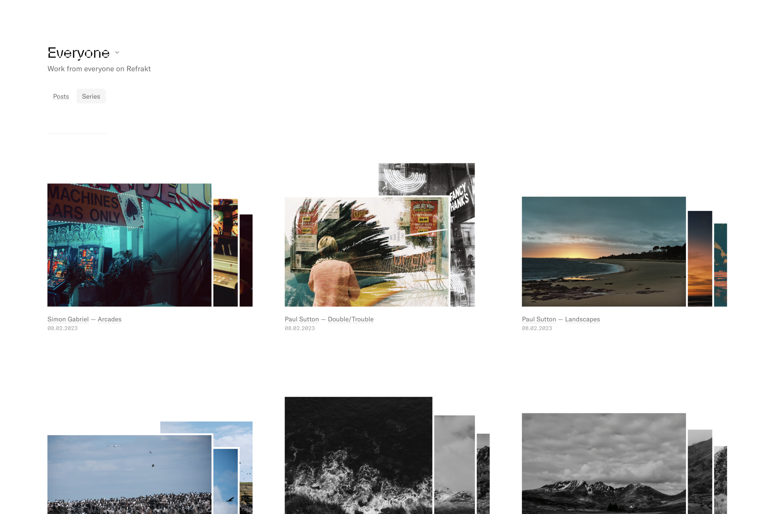
If you have a keen eye, you may have seen some visual improvements around Refrakt. We think Refrakt is in it's awkward teenager phase right now as there are some things that haven't changed since launch, and others that have changed a lot, but that's ok.

The main recent change is a better photo detail view with zoom, allowing you to see more of those lovely details. Images are shown larger as the side panels are now closed by default, giving extra room on big screens.

We've also improved the way in which you create Series. We experimented with having everything on one screen for editing the details and adding/organizing posts. After using it for a while, we felt it was in fact too clunky, and we've reverted back to having separate steps. However the organize flow should now be more clear than our first version, with a lot more real estate for actually moving your work. You can still add posts from your Studio, or upload new work, but this now included the new bulk creation flow which should speed things up.

There's also been a bunch of general UI changes, but there's still a bunch to do and we're slowly chipping away.

Looking forward

Instead of listing bug fixes and improvements, we thought we'd take the time to let you know what we're planning on working on over the next couple of months.

  • Categories
    We're going to be adding some fixed categories that you can assign to your posts, Series, and Collectives. These categories would be things like "Abstract", "Street", "Portrait" etc. We've had this in progress for a while, but it's almost ready. We're planning on pre-populating your existing posts with categories based on any tags they have. We still have to map over 1,400 tags to the correct categories, for example the tags "film", "portra", and "mamiya" should be mapped to the "Film" category.

  • Discovery
    This area is super important, but is lacking a bit right now. We have a manual posts feed where Sam adds interesting work, but we want to expand that. It would be nice if you could more easily find interesting photographers to follow, along with topics, Series, equipment etc.

  • Series updates
    A nice thing about Series is that they can be added to over time, however updating an older Series doesn't push it back to the top, so we'll be adding more sorting options soon. We'd also like to add the ability to follow a Series so you can get updates when new work or comments are added, add some collaboration features for group Series, and some story telling elements like text and more layout options.

  • Location info
    This is the number one requested feature on our Roadmap and something we want to ensure is safe. We haven't started this yet, but we've done some initial research and have a vague idea of how we want to approach it. Watch this space!

As always, there's tonnes of stuff we could work on, but Refrakt is only a one person team! We have to make sure the development is focused, and we don't try to do too many things. We want to keep Refrakt simple to understand and use, but still remain valuable to a large number of people. We always welcome suggestions to the Roadmap, and we love seeing your ideas!

We appreciate this was a long update. If you made it this far, you can use code CHANGELOG20 at checkout for 20% off your first year of Premium. It'll be valid until our 1 year anniversary on the 31st of March, 2024.
Changelog –

Collaborate with Collectives

Start collaborating on feeds around topics and themes


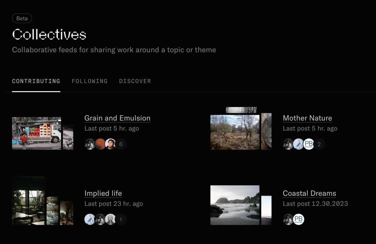
A screenshot of the Contributing tab on the Collectives page, showing all the collectives you have currently joined.

Get quick access to all the Collectives you're contributing to

It's been a while since our previous changelog entry, but we're excited about this one. We've just launched the beta version of Collectives. They're a way for people to group up and share work around a particular topic or theme. It's in beta because there's still a few kinks, but the core flow is ready for your feedback.

There's something interesting about collaboration on "social media" that we don't see too often elsewhere. Creating feeds together is the first step. We have plans to develop Collectives into something much more over time. We'll be adding proper discussion topics, private feedback groups, and group curation.

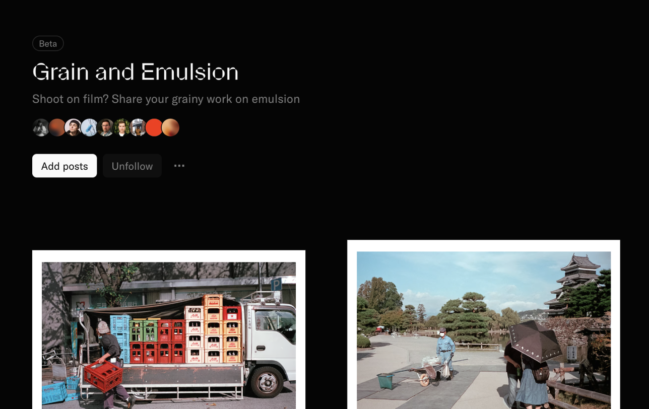
A screenshot of the Grain and Emulsion collective, a place for film photographers to share their work

The Grain and Emulsion collective for film shooters

Right now, anyone can create a Collective and choose how people join. You can have a moderator approve requests to join, or set them to automatically approve. Once you have people in your collective, you can then change their role.

The "Curator" role will be more important later on. Curators will be able to add other's work to the collective and manage the post submission process. Curation is still in progress, but it opens up some interesting use cases. It also opens Refrakt to photography enjoyers who may not be photographers themselves. For example Gallerists who want to curate online exhibitions.

Sam and some Refrakt regulars have already created a couple of Collectives. You can check them out on the Collectives Discover page. As always, we'd love your feedback, and don't forget you can add your suggestions directly to our Roadmap.

Improvements

There's been a lot of small improvements since the last update, so here's the more significant ones.

  • Added default settings for new posts copyright notice, privacy, comments, and camera information.

  • Added non-destructive borders for posts.

  • Added the first version of our marketing/about page.

  • Added a small AMA page where you can ask us anything.

  • Added a way to manage muted and blocked users to settings.

  • Improve the loading speed of the Discover page.

  • Added NSFW settings to posts. Users can toggle NSFW blurring across Refrakt from their settings.

  • Added a hover card to profiles in posts and comments.

Bug fixes

  • Fixed social previews for posts and user profiles.

  • Fixed created and updated timestamps preventing some posts from being published correctly.

  • Fixed mentions and URLs display in comments and profile bios.

  • Fixed double scrollbar issue in search on Windows.

  • Fixed an issue that prevented creating a post without tags.

Changelog –

Refrakt for all

We've opened up Refrakt to everyone!


The first post on Refrakt where Sam prompted people with "What brings you to Refrakt, what are you hopeful for?"

A little over 6 months ago, we launched Refrakt in Private Beta. We did this so we could build out the core set of features and gather feedback from a small number of users. We had a wait list and periodically added new folks, and quietly got on with building. Things are holding up technically, and we have all the safety tools we need for on-boarding more people, therefore…

Starting from today, anyone can sign up!

This is a pretty huge milestone for us, one we weren't sure we'd see at times! "Us" is still just Sam, and it's not been easy building or marketing Refrakt as a one-person-company.

There's still things on the roadmap that we'd love to get to ASAP, but we have to be pretty ruthless in terms of prioritising. We've been doing a bit of reflection and planning on where we want Refrakt to go in the future, and for us, it's three main areas:

  • Connecting with, and uplifting others

  • Showing off your best work

  • Pro-tools for advancing your photographic journey

We'll go into more detail on each of these over the coming months, but the things we want to build will largely align with these topics and roughly in that order too.

Spreading the word

Now the foundation has been laid, we feel a lot more confident in what we're building, and our plans for the future, but we still need your help.

If you enjoy using Refrakt, we would absolutely love if you told your photography friends about us. Sharing a link to refrakt.app goes a long way! Maybe even pop a link to your Refrakt profile in your social bios.

We'd love to see more work shared here, and more people aligned around our vision of becoming a more meaningful home for photography.

Thank you to our Patrons

Our wonderful Patrons have contributed to keeping the platform running, and we can't thank them enough for their support.

If you would like to become a Patron, you can do so at any time from the Patrons section on the About page. By becoming a Patron, you get a badge on your profile, a featured spot in search, early access to new features, and play a pivotal role in the platform's evolution.

Patronage is pay-what-you-like with a minimum amount of $20 to get all the perks.

Thank you to our Pathfinders

These are the people that joined the private beta and shared their work with the rest of the community. They've been an integral part to the platform so far, and we just wanted to say how much we appreciate them.

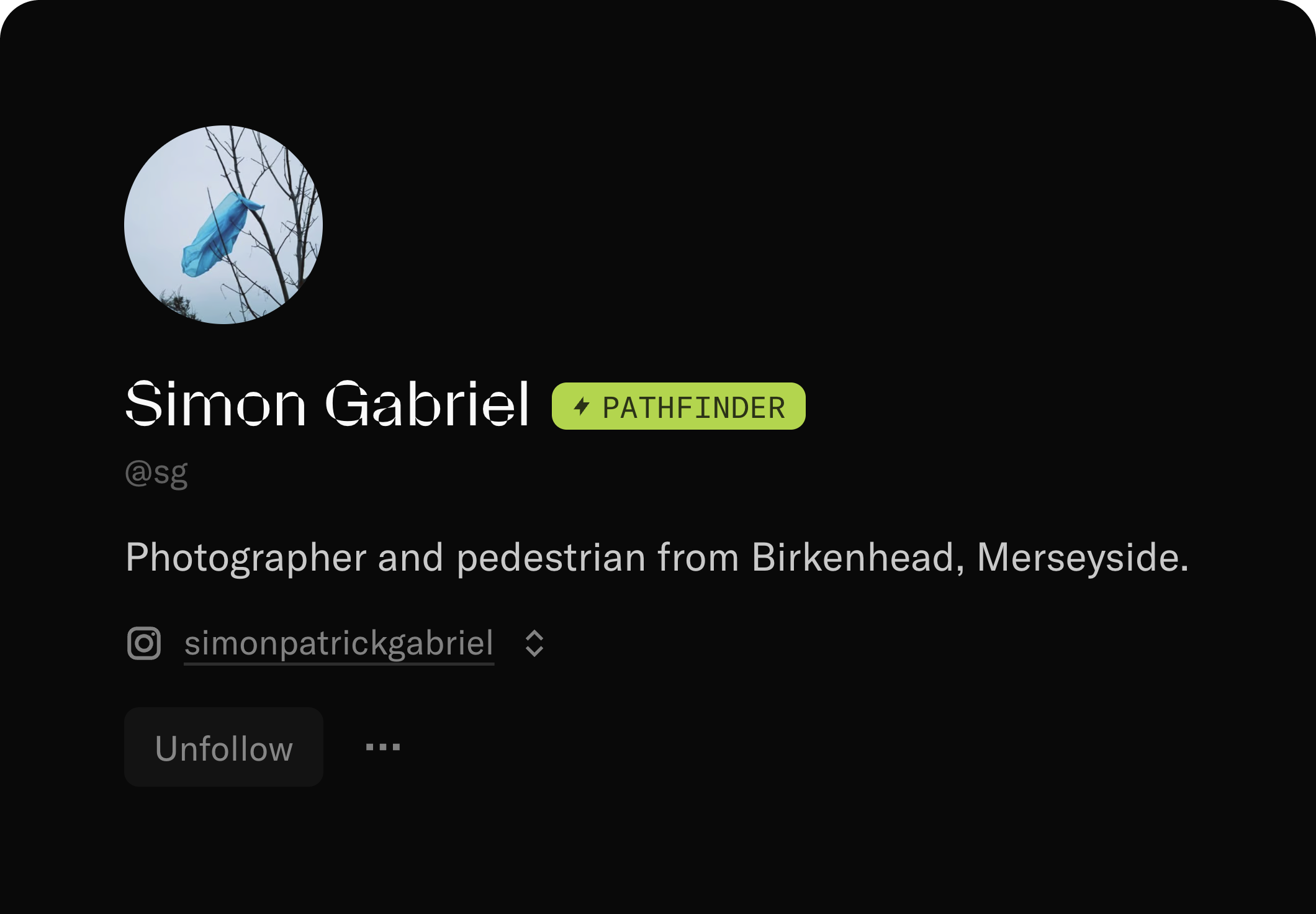
If you're a Pathfinder, we've added a little badge to your profile. It's yours to keep forever, and it signals your early support of Refrakt of which we're immensely grateful!

A screenshot of Simon Gabriel's (@sg) profile, showing off the new Pathfinder badge next to their name.

The new Pathfinder badge

Improvements

  • We've cleaned up the design of the feeds so they're a little less distracting. There's now even more of a focus on the photos.

Bug fixes

  • Fixed the layout of the notification settings page that meant the sidebar was hidden.

  • Fixed a bug that meant navigating between posts when expanded, would do a full reload and you'd lose the ability to navigate to the next post.

Changelog –

Improvements to safety

Helping you control your experience and stay safe on Refrakt


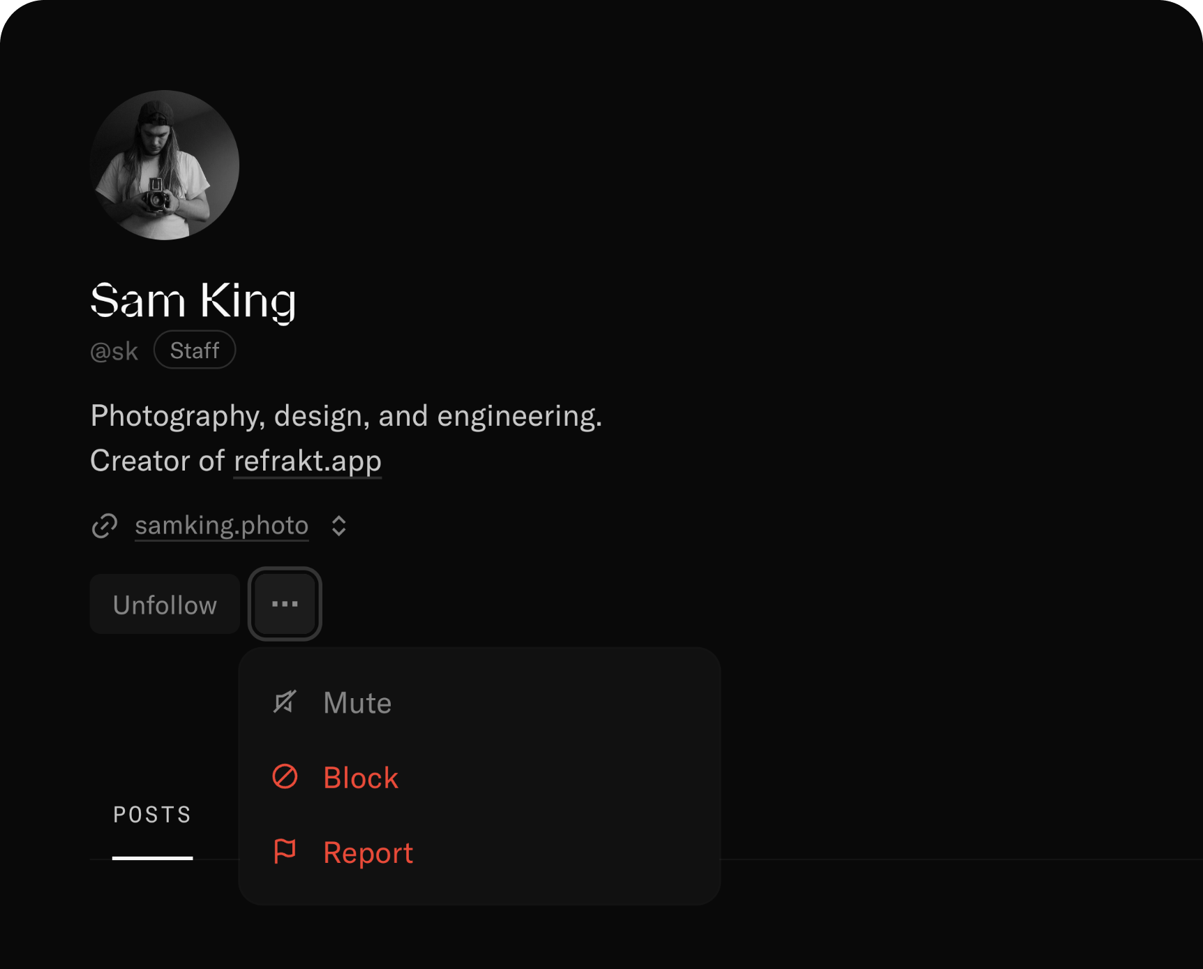
A screenshot of a profile on Refrakt with the overflow menu open. The menu contains new options for muting and blocking.

New safety options on user profiles

Muting and blocking are table stakes features on any community based platform these days. We haven't needed anything like this yet, partly due to the size of our community, and because we've been selective about who has access. These conditions will of course change as we open up the beta to more people, so it's time we added them now.

We hope to foster a good community that adheres to our Community Guidelines, but there may still be cases where you want to prevent someone else from interacting with you, or you may not want to see their work anymore. Muting and blocking will allow you to do just that.

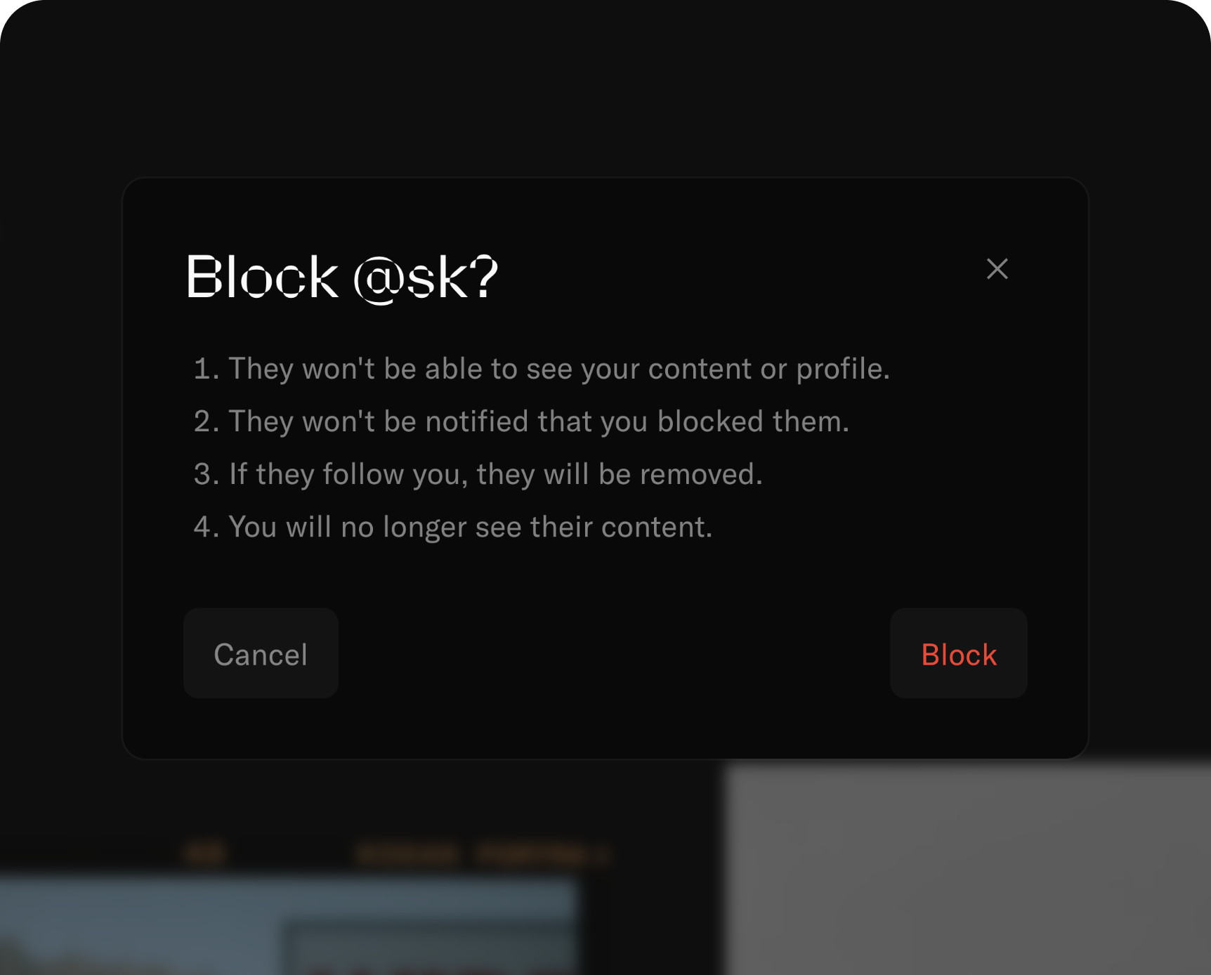
The new block confirmation modal explains what happens when you block someone

While we value freedom of speech, that doesn't mean freedom of consequence. If we see an increased number of blocking or muting on your account, we will be proactive in investigating the reasons, and may give you a warning.

This isn't meant to be scary, but we are serious when we say we do not tolerate harassment or abuse, and we hope you feel the same way. We want Refrakt to be a safe and fun place to hang out and share your work.

What to do if you find issues

We say "we" but it's still just Sam working on Refrakt, and that includes moderation and fixing bugs. There may be some areas of Refrakt where muting or blocking doesn't get you the desired results. We kindly ask that you use the feedback form to let us know if you still see someones content that you have muted or blocked!

Improvements

  • We've added a little notice banner at the top of Refrakt that we can use to inform you of important messages. We had some issues with our image provider that prevented files from being uploaded correctly, so we used this notice to share an update. Hopefully we don't have to use it very often, but it's handy to have!

  • Your own posts are now excluded from the "Following" feeds. We think this improves the noise ratio when you want to narrow your feed a little. They still appear in the "Everyone" feed.

  • We've improved the messaging on profiles, posts, and series when you cannot view certain content. This could be because you've muted the user, been blocked, or the user has been suspended etc.

  • We've also made some small improvements to the wait list and sign up pages so they now link to each other a bit better.

Bug fixes

  • Fixed a bug where the unfollow button would stop working.

  • Fixed a bug with permissions that prevented you from deleting your own posts.

  • Fixed a few UI animations.

Changelog –

Staying in touch

Improving how you stay up to date with each other, and Refrakt


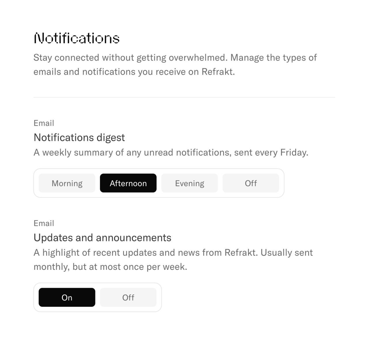
New notification settings page

It's been a little while since we last shared a changelog entry, but we've been busy! There are a couple of new features and some smaller updates that may have gone under the radar. We've also squashed a tonne of bugs.

Let's start with notifications

We hate getting notifications for things we don't care about, things that cause unnecessary distractions. We think there's a better way of staying in touch, so we're rolling out the first version of email notifications.

You can now opt-in to two new emails:

  • "Notifications digest" is a weekly email sent every Friday with up to ten of your most recent unread notifications. Have nothing to see? We won't send the email. You can also choose the time of day you'd prefer to be emailed; in the morning, afternoon/noon, or evening.

  • "Updates and announcements" is a more ad-hoc email with updates, much like this one, and announcements related to Refrakt. These will likely be sent out monthly. Some months there may be more, but we won't send more than one in a week.

You can turn these on from your notification settings.

It can be pretty hard to stay updated since Refrakt is web-only for now, but we hope these new emails hit the right spot without being overwhelming. We'll be adding more types of opt-in emails over time, and we'd love to hear what you think about them.

All about discussion

We've also shipped improvements to discussions and comments. You can finally contribute to discussions on Series! Since we launched Series, the only way to talk about them was to comment on each post individually. Now you can let people know what you think about the entire series directly which is so much better.

Discussion prompts have had a little makeover. If you add one to your post or series, it will now be displayed directly under the description to highlight you're open to discussion. This should help spark more conversations, and we've loved reading prompts that have been added already.

The last thing about comments is they're now threaded! You can reply directly to a comment. Previously you could only mention someone else, but this small UX improvement should make following conversations a lot easier.

Coming up

There are some things we're building that aren't quite ready yet too. We've made some good progress on the Collectives feature, a way to create a space with others to collaborate on feeds, discuss specific topics etc. Collectives will be a little bare bones to start with, and we may keep them to Refrakt Official spaces while we test them out, but we're excited about where they could go.

We're also continuing work on Subscriptions, but it needs some more internal testing before it's ready to be enabled. We'll share updates later.

That's it for now. As always, we'd love to hear your feedback. We want to make sure we're building the right thing. A nice place on the internet to hang out, talk shop, and share your lovely images.

Improvements

  • A new tagline: "A more meaningful home for photography".

  • A whole new icon suite that feels more aligned with the Refrakt branding (the brand still needs some work, so if you know a brand designer, send them our way).

  • The Series create and edit screens are now more streamlined and easier to use.

  • Made the comment text box easier to use on mobile devices.

  • Notifications have been simplified in design and should be faster to load too.

  • Notifications now deep link to the content e.g. clicking a comment link takes you directly to the comment with a little highlight.

  • Shiny new footer with more helpful links.

  • Added a proper sitemap for better SEO on profiles and posts.

  • More options for reporting abusive content on posts, comments, etc.

Bug fixes

  • Fixed a bug where some posts wouldn't show in the equipment feeds.

  • Fixed a bug that prevented saving when editing a post with no tags.

  • Fixed a bug where bottom sheet items didn't open in a new tab correctly.

  • Fixed a bug that would set the wrong publish date when saving a series.

  • Fixed popular tags not being calculated correctly on the Discover page.

  • Fixed a bug that would let you create an incomplete film stock.

  • Fixed a bug where you would get a notification if you replied to your own comment.

  • Fixed a bug that would prevent deleting comments.

  • Fixed a bug where social preview images would fail to generate for specific posts.

  • Fixed a bug where hidden posts would show in the series preview stack.

Changelog –

Props for posts

An extension of likes to give more context and meaning


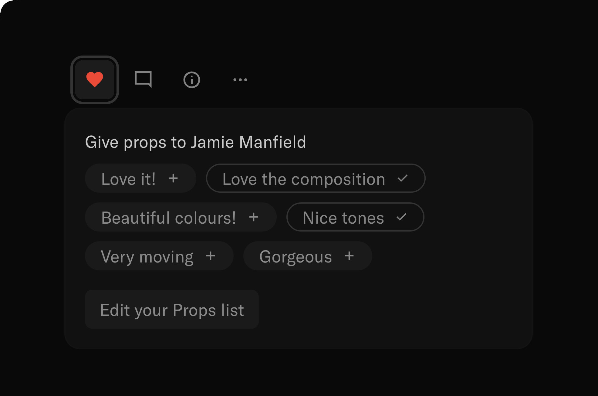
A screenshot of the props button on a post. It shows the Props menu in the open state with some props already selected for the photo such as 'Nice tones'

Using the new Props menu on a post

Previously you could like a post, a common pattern in social media, and we added likes because there's definitely a use case for them. Likes were only visible to the photographer so we could avoid some of the pitfalls of traditional social platforms, for example the like count being a measure of success (which isn't necessarily true).

There's another problem with likes though. A like doesn't really say much. When you receive a like, it can be a good indicator that your work has resonated with someone, but that's it.

We think there's a better way. Something that's still easy to give out, but that's more meaningful for the person receiving it. We're calling it props.

Props allow you to give a little more context to your appreciation without feeling like you have to post it publicly in the comments. You can give props for a specific reason, such as the composition, the lighting, the subject, or the editing. You can also give props for a more general reason, such as the overall quality of the photo, or the photographer's style. How you use them is up to you.

They're super quick to set up. You can add up to ten short phrases to your list. We have some suggestions you can use, but you can also write your own to match your own voice. You can then give props for the work you find on Refrakt with the heart button. Now the photographer gets a little more context about why you liked their work!

We hope you enjoy using props, and we'd love to hear your feedback.

Improvements

  • Made the settings pages more clear by updating icons and copy.

Bug fixes

  • Fixed a bug preventing people from signing up after receiving a wait list invite.

  • Fixed a UI bug on the roadmap page.

Changelog –

Series Feed

Better discovery of Series across Refrakt


A screenshot of the new Series tab on the Home feed. It shows several series posted by photographers on Refrakt.

The new Series tab on the Home feed

Series are still in the testing phase but we think they have a lot of potential. Since we released them, they've only been visible on profile pages. This isn't too great for finding this type of work.

To remedy that, we now have a dedicated tab on the Home feed to show recently published series.

Series won't show up here (or on your profile publicly) unless the visibility is set to "Public" and they've been published.

We're going to improve this feed a little more and also bump recent additions to the top, for example if you add new work to an ongoing series, we want to highlight that!

There's still a bunch of improvements we want to make to Series in general, but we're slowly getting there.

Bug fixes

  • Fixed a bug with the sort order of recently joined people in search

Changelog –

Improved Home Feeds

Preparing for the future of feeds


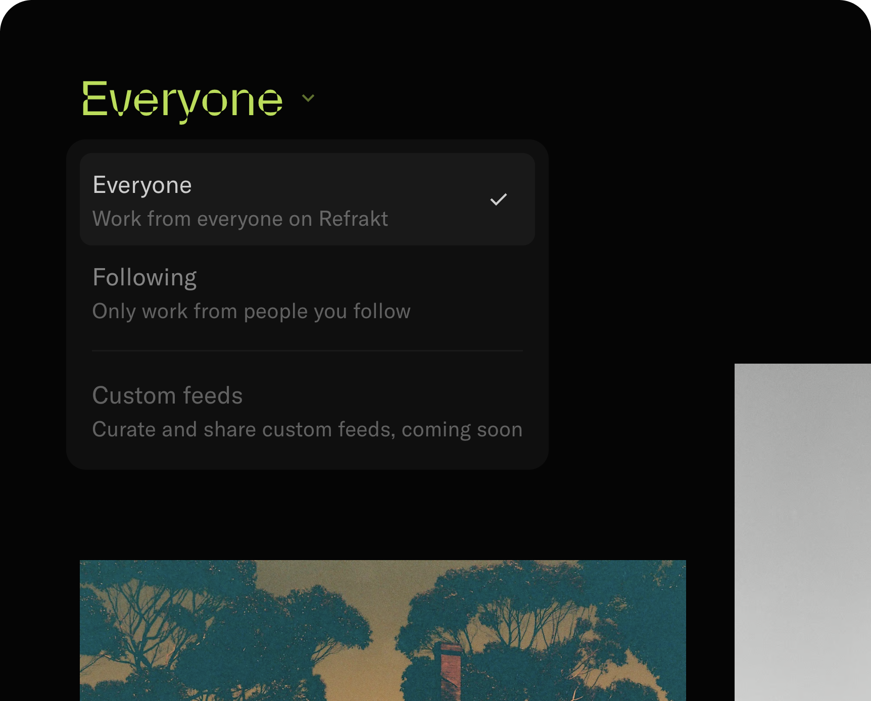
The new Home feed switcher

There’s now two main modes on the Home feed. Both feeds are chronological, but one is for everyone on Refrakt, and one is just for the people you follow.

This has a nice benefit in that you can browse the “Everyone” feed to find new work from across Refrakt, but you still have a more focused space to retreat back to. Since there’s not a lot of people on Refrakt right now, both feeds update at a manageable pace, but we imagine the “Everyone” feed will grow over time and the “Following” feed will become more necessary.

We’ve also had an idea for more curated feeds for a while now, and this small UI change will allow us to expand to other feeds in the future. What if you could create your own feed based on tags, cameras, people etc. and then make these feeds public for others to follow? This sort of exists on Twitter right now in the form of lists, but there's a cool element of being a curator buried in there somewhere.

If you have ideas around this topic, we'd love to hear it! Leave a suggestion on the Roadmap.

New Search

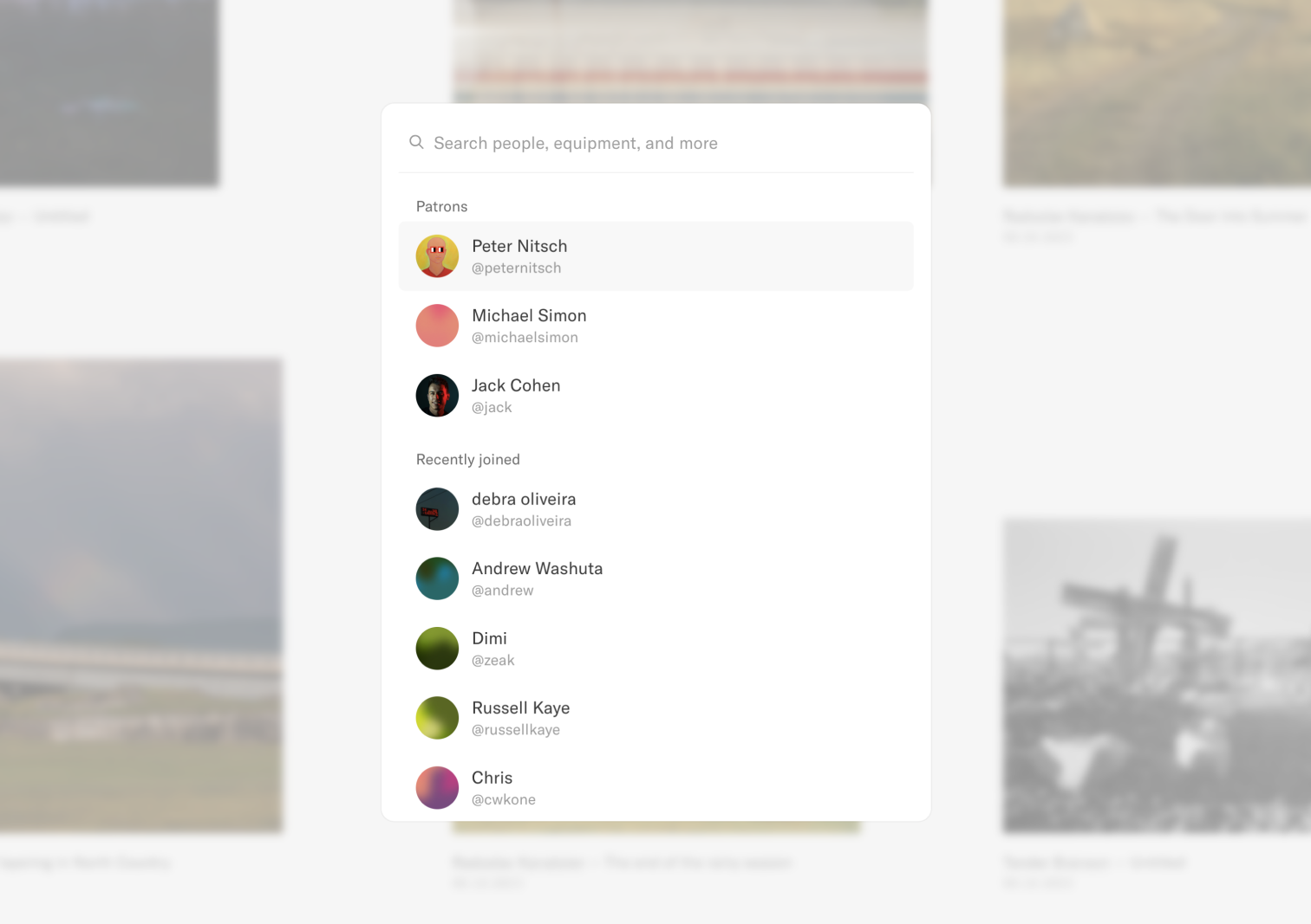
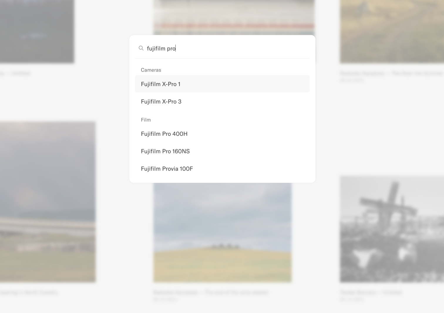
Previously Search was just a small input in the header. It didn't give you any indication about what was actually searchable. We've given it a lick of paint and it now shows off people who recently joined Refrakt too!

The new empty search state

Search across people, tags, and equipment

Improvements

  • Moved the Discover page to it's own dedicated area instead of mixing it with the Home feeds.

  • Added a Threads icon when adding a link to your Threads profile.

  • Cleaned up authentication pages so they can also be opened in a modal.

Bug fixes

  • Fixed the link to the Discover page when receiving a notification that your post has been added to the Discover feed.

  • Fixed a layout bug on the Posts grid where the author name would wrap to a new line.

  • Fixed some responsive layouts for new/edit/view post page templates.

  • Fixed bottom sheets with buttons from submitting forms when they shouldn't.

  • Fixed various UI bugs around the site.

Changelog –

Film and Camera bags

Want to see photos shot on Portra 400? Now you can


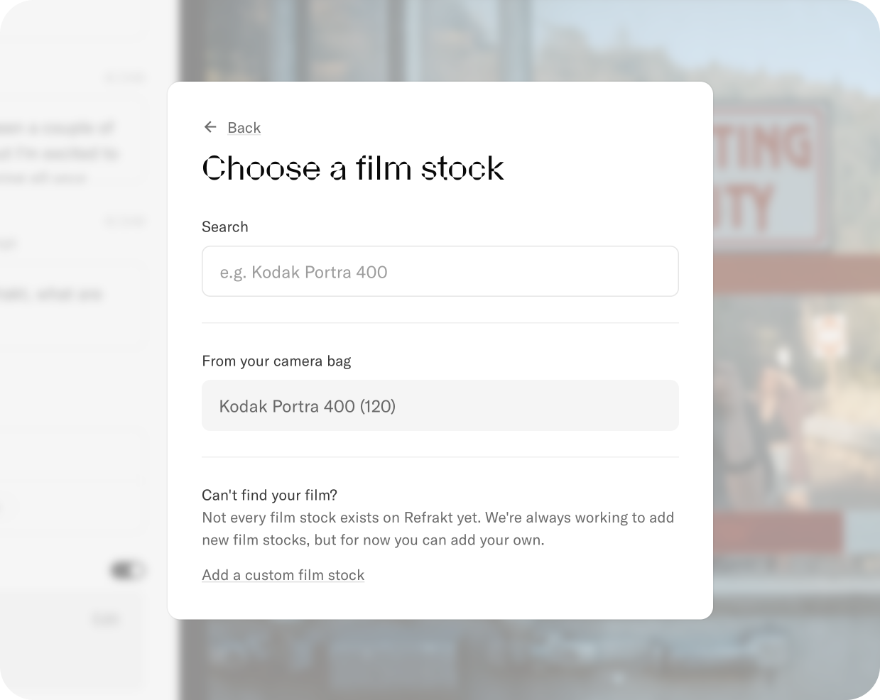
A screenshot of the "Choose film stock" modal that appears when creating or editing a post.

Choosing a film stock when posting

When you add a new photo to Refrakt, we automatically pull out any EXIF data from the photo. This works well for digital where that data is automatically included in the image, but it doesn’t work that well for film. You can always add the camera metadata manually in something like Lightroom, but there's still no standard for film stocks and scanners.

Now when you post to Refrakt, you can change the camera, lens, add a film stock and the scanner you used. All this information then allows your post to appear in film stock feeds, camera feeds etc.

As with other parts of the post, this is totally editable after it’s been shared too. Accidentally set the wrong lens? Don’t worry, you can just go back and change it.

We've gone ahead and loaded in most of the popular film stocks like your Portras and your Ektachromes, but there's so many niche stocks that would be too much to add and verify up front. That's why we also let you manually add new film stocks (as well as cameras, lenses, and scanners). Manually added equipment will appear on your post, but it won't be visible in search until we've checked and approved it. We think this is a fair trade-off for the time being. We'll likely load in more cameras and film stocks over time.

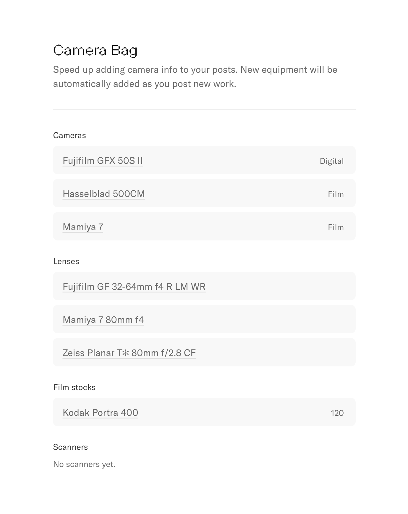
Your camera bag

To make the process of adding this information a little faster, we now save any new equipment to your camera bag. Items from your camera bag appear when editing camera information so you don't have to search for them over and over.

You can remove items from your camera bag settings page.

A screenshot of the camera bag settings page that lets you remove cameras, lenses, film stocks, and scanners.

Manage your camera bag from settings

Another cool thing with the camera bag is that in the future, we could show this information on your profile. You could let others know you're more of a Fuji fan than a Kodak fan, or you could just flex that sweet XPan. We'll share more on that later.

Improvements

  • We've made the like button red once you've liked a post for better visual clarity.

Bug fixes

  • Fixed general autocomplete layouts on mobile e.g. search and mentioning a person in a comment.

  • Fixed some styling issues on the "Report post" modal.

Changelog –

Pinning posts

Show of your best work at the top of your profile


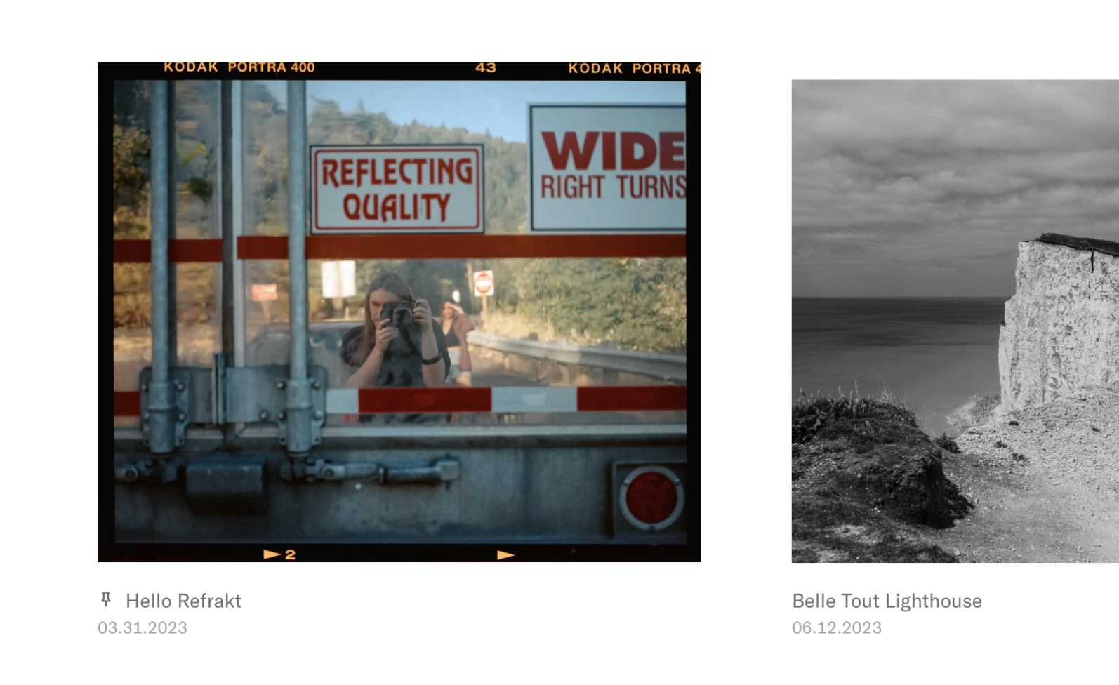
A screenshot showing a post that is pinned to the top of a profile. It features a small pin icon next to the title.

Pinned posts on your profile

You can now pin up to 3 posts to the top of your profile! It's become a bit of a norm now, but for a good reason. Pinning content to the top of your profile is a great way to show others what you're most proud of, or something that really highlights your style.

To pin a post:

  1. Find the post you want to pin and open it up.

  2. Click the ellipsis button in the sidebar and select the "Pin to profile" option.

  3. Confirm that you want to pin the post.

If you want to remove a pinned post, just go through the same process. If a post is already pinned, the option will be called "Unpin from profile".

That's it, a nice short changelog. We'd love to see what you choose to pin.

Improvements

  • We finally added an About page that details more of why we're building Refrakt, how it's funded, and what we're working on!

Changelog –

Reporting content

Making your experience safer on Refrakt


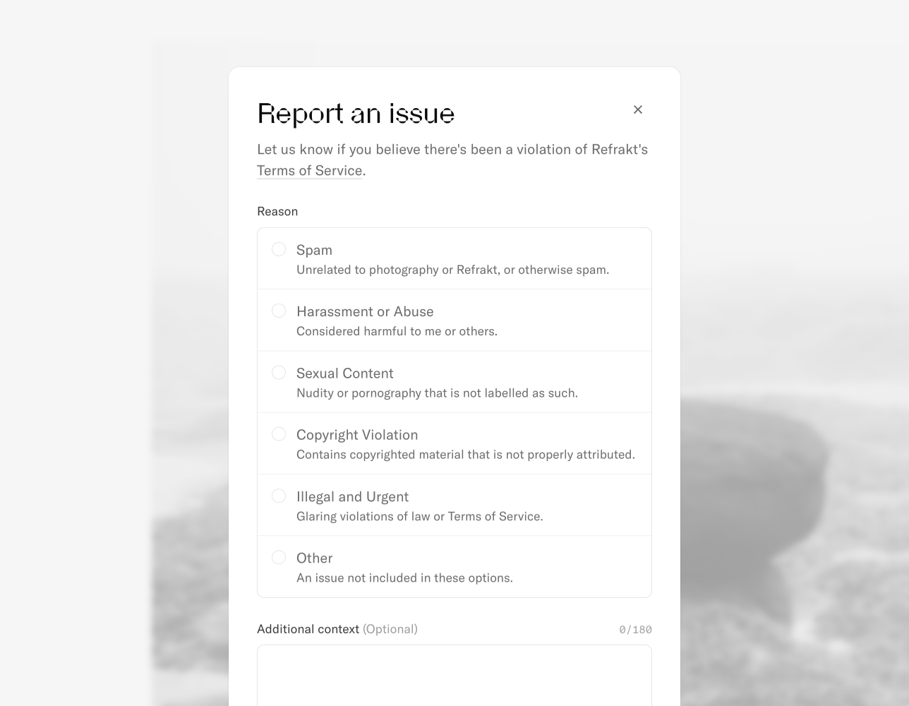
A screenshot of the "Report and issue" modal that shows options for why you want to report a piece of content.

The new issue reporting modal for a post

We want to foster a kind community on Refrakt, however there are always things that slip through the cracks. We've added a way for you to report content you see on Refrakt that goes against our Terms of Service or Community Guidelines.

These are the categories you can add a report for:

  • Spam: Unrelated to photography or Refrakt, or otherwise spam.

  • Harassment or Abuse: Considered harmful to yourself or others.

  • Sexual Content: Nudity or pornography that is not labelled as such.

  • Copyright Violation: Contains copyrighted material that is not properly attributed.

  • Illegal and Urgent: Glaring violations of law or Terms of Service.

  • Other: An issue not included in these options.

You can also provide some additional context alongside these options, for example more information on copyright violations etc.

It's available for posts right now, but we'll be rolling it out to other content types shortly.

Thankfully everyone here is great and we haven't had any violations yet, and we'd love to keep it that way! So thank you for already being kind and conscious of others.

Improvements

  • We've massively increased the page speed of post detail pages when linked to directly. They're statically rendered so they're super fast, and they get re-rendered when changes are made such as a title or description change.

  • We've added a new even faster version of the homepage for logged out users. It doesn't update in realtime, but every 10 minutes or so. This is great for people curious about Refrakt, and search engines etc.

  • If a post is part of a series, we now show a link to the series in the post detail view.

  • We've improved the error handling for various parts of the site. This helps us get better visibility on when things break and how. This should mean fewer bugs and faster times to resolve them.

  • We've left behind the wordmark version of the logo in favour of the icon type logo in the app. We want fewer distractions when using the site. We'll still use the wordmark in branding outside of the app, so it's not gone forever!

Bug fixes

  • Fixed a bug that would allow creating a post while an error was present with the image upload.

  • Fixed a bug where replacing an image when creating a new post would actually post the previous image you selected.

  • Fixed a bug that would duplicate tags on a post.

  • Fixed a bug that caused roadmap issue votes to not be recorded correctly.

  • Fixed a bug that would incorrectly redirect you to the wait list.

  • Fixed a bug with the shareable invite page that would prevent people from signing up, even if they had a valid link.